
Design Lead, Product Design, DesignOps, UX Writing, QA
An ambitious platform based on personalization that aims to unify the experience for all the main JOTA products
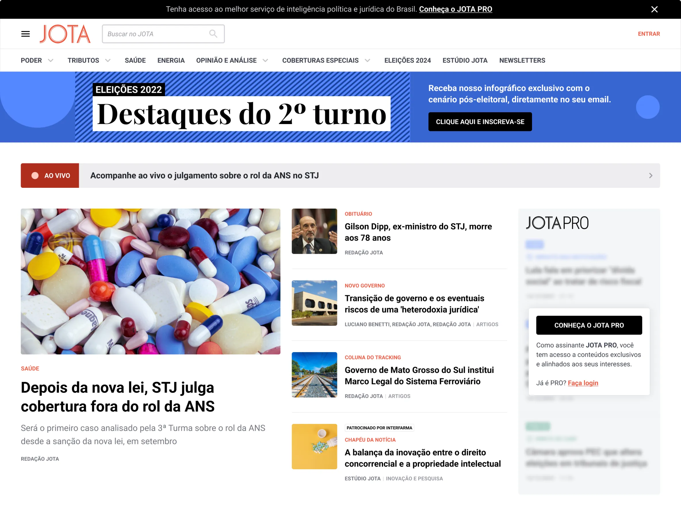
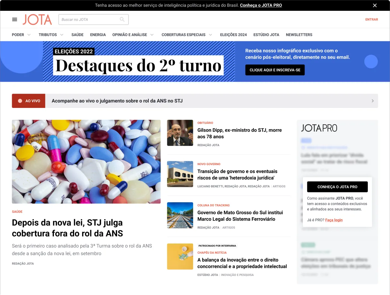
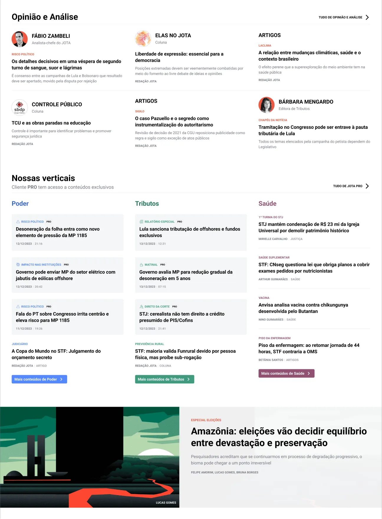
JOTA “Único” is a project born from the idea of unifying the experience of the JOTA news portal plus the suite of products, solutions and tools for decision makers, JOTA PRO.
With our previous project, JOTA PRO, not having worked out as we wanted, the stakeholders expected us to come up with a plan B. With personalization still in mind, we decided to go back on the idea of separating JOTA from JOTA PRO, and instead unify them into a single, ambitious platform, thus taking the implementation of our Design System to the max.
While JOTA PRO had partially mitigated the pain of some customers, we still received the same complaints and suggestions in our feedback channels (large amount of content in their inboxes, and the lack of customization). Along with this, we also needed to increase our base of leads and potential subscribers, or MQL per se (Marketing Qualified Leads).
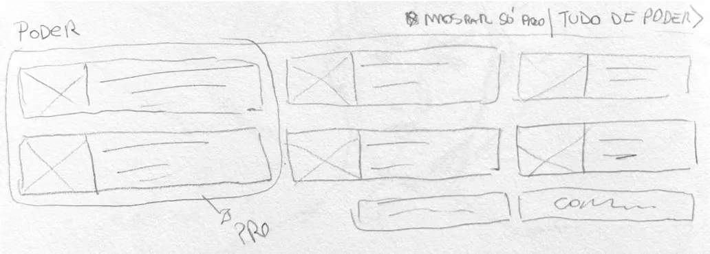
Our team facilitated a workshop to define the Jobs to be done, alongside with the Marketing and Growth teams. As a result, we delivered what would be the ideal world for our PRO clients. Thanks to the Design System, designing these wireframes in high fidelity took very little time. We still focused solely on the PRO experience. But that was about to change.
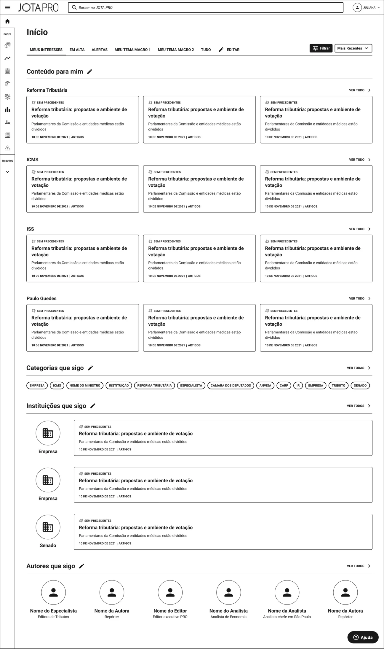
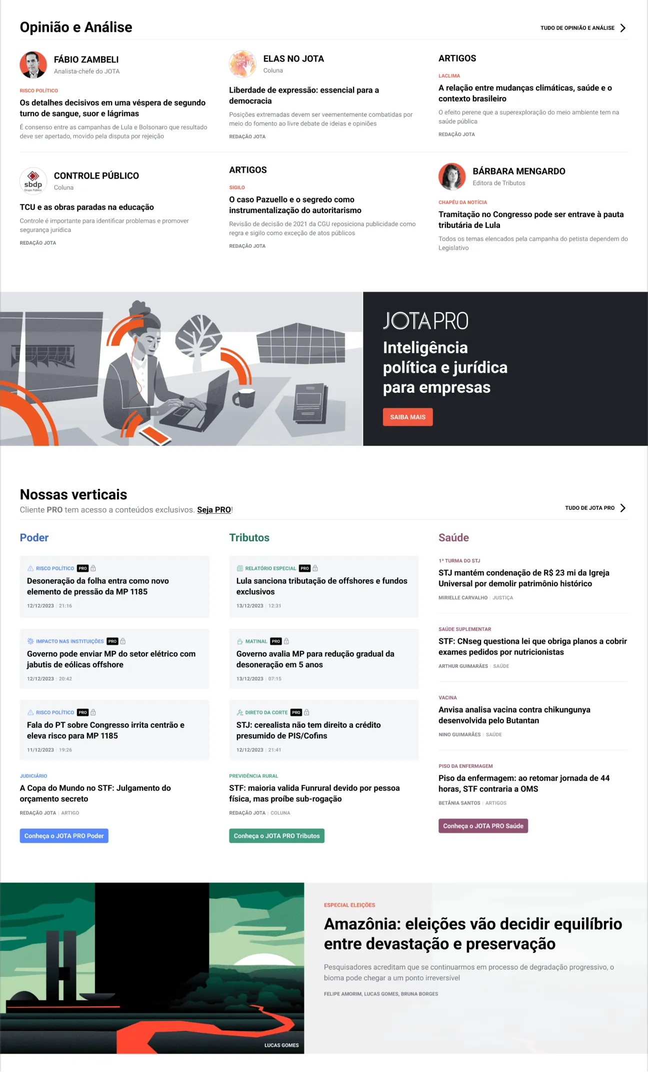
As seen in the workshop wireframes, the plan was for us to continue with the idea of full content customization, allowing PRO users to create a homepage aligned with their interests and needs. Users who were not PRO subscribers would see a similar homepage, but with PRO content locked, with hopes of it triggering their FOMO (Fear of Missing Out) and raising their interest in asking for a trial - and subsequently increasing our lead base. We also wanted to invest in PLG (Product Led Growth), encouraging subscribers of one coverage (e.g. Poder) to subscribe to another (e.g. Tributos).
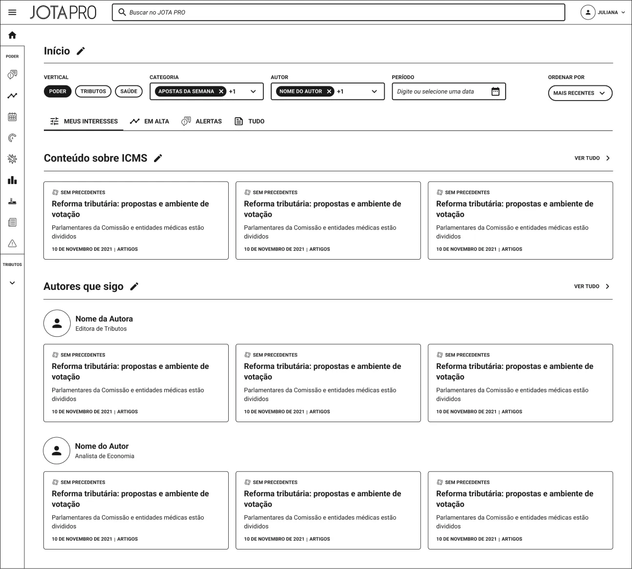
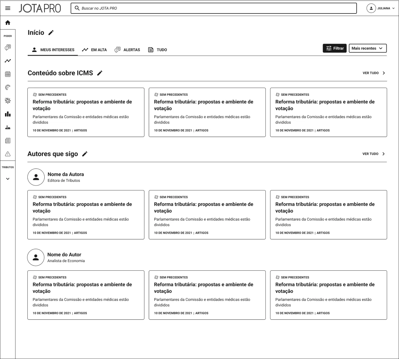
With my mind set on what needed to be done, I've started with the design of the first version of the homepage. It would drastically change later, due to scope size and time, but the seed was planted. With this design, we had the most of what we needed to continually improve JOTA Único's homepage, subpages and its features. A solid, long term plan.
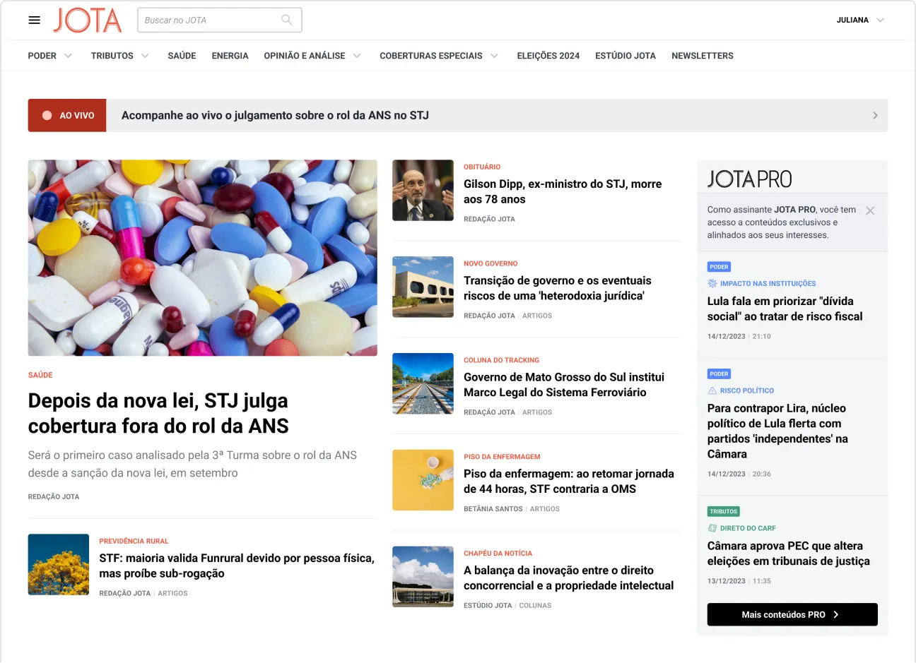
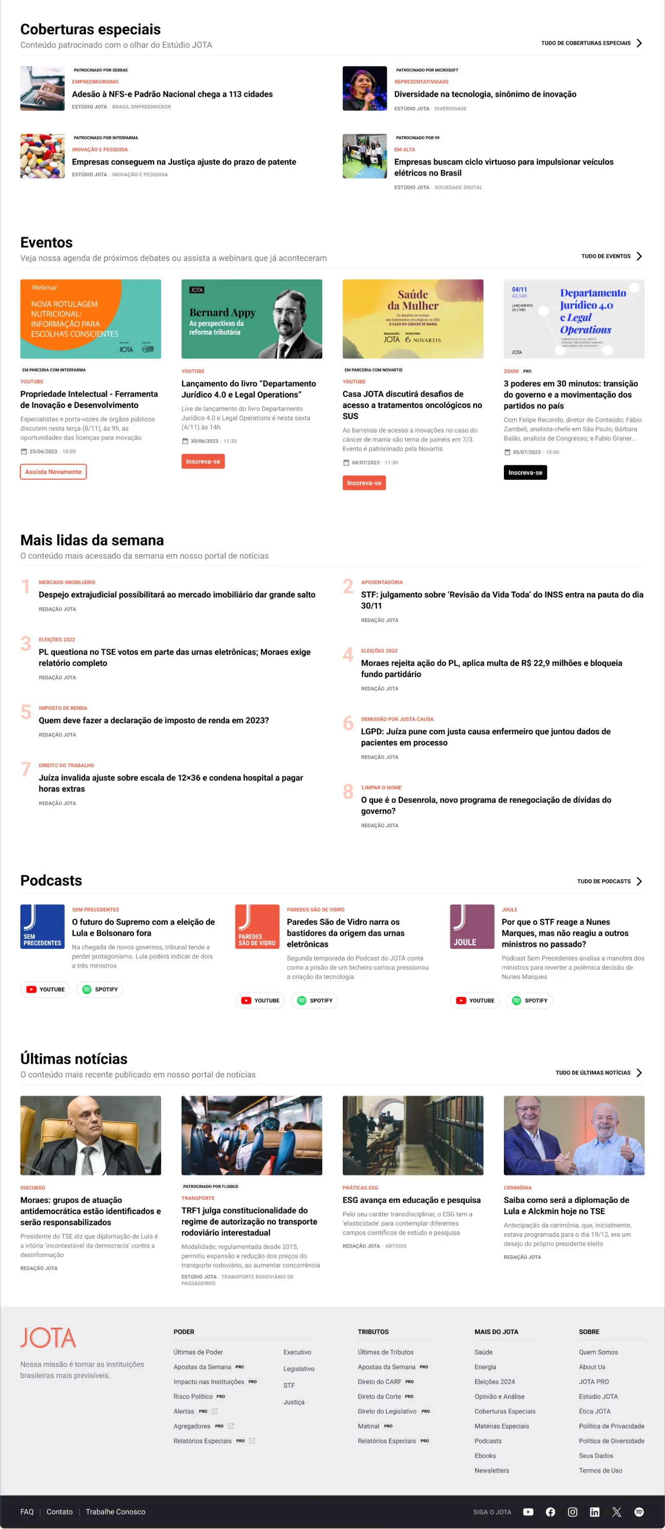


After the homepage, I followed up with the design of the next most important screens for the MVP: the the articles/PRO content pages and the search results page.
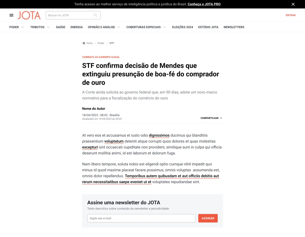
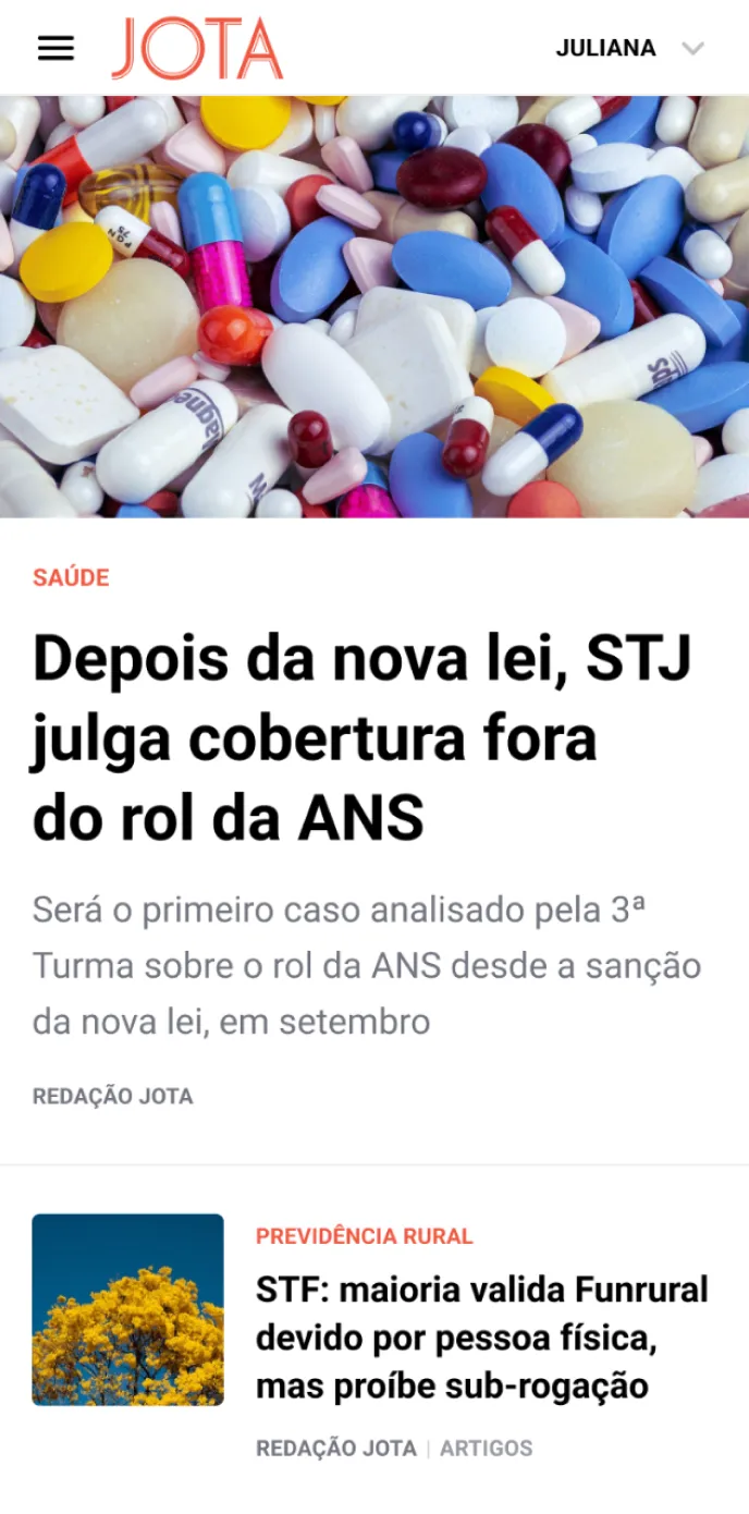
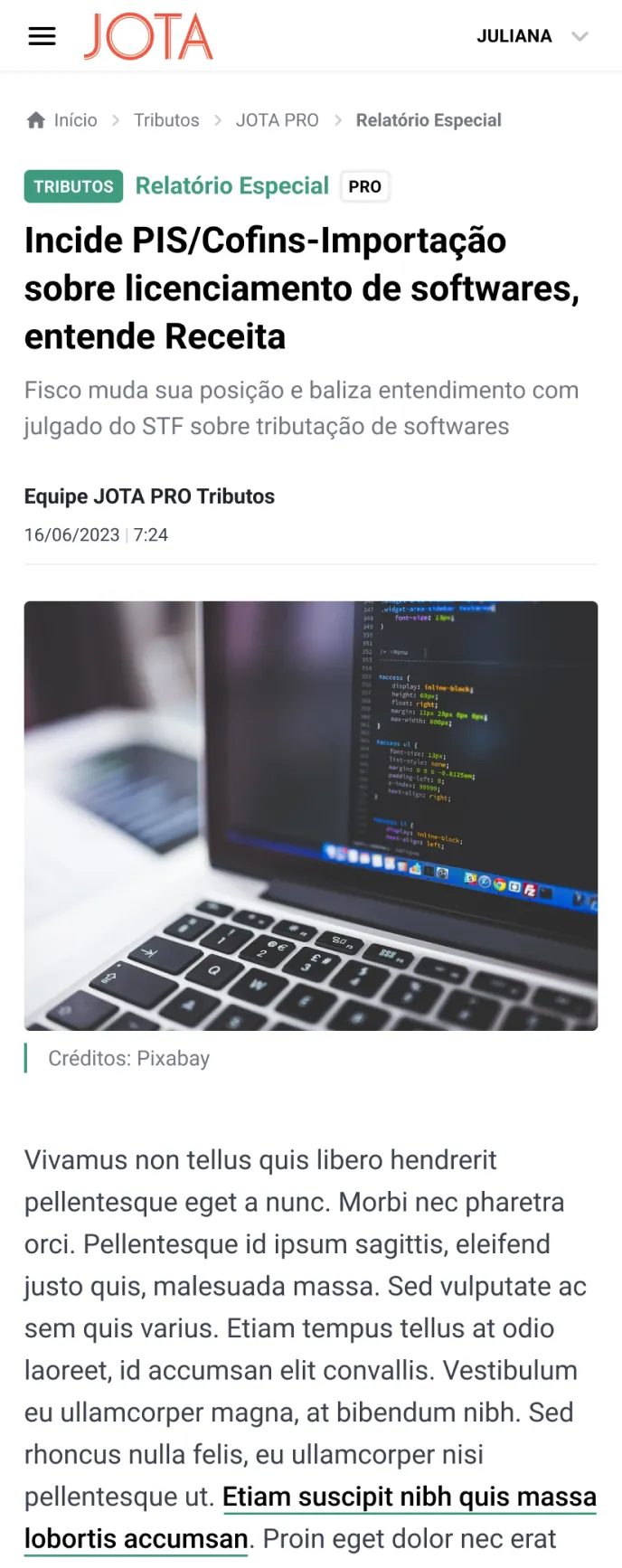
Detailed view of the different types of posts: common article, sponsored article, PRO Poder content and PRO Tributos content. We call the common articles “posts” because they're imported via Wordpress. PRO content is imported via Mailchimp. Here they stop being a newsletter and take on the format of an article.
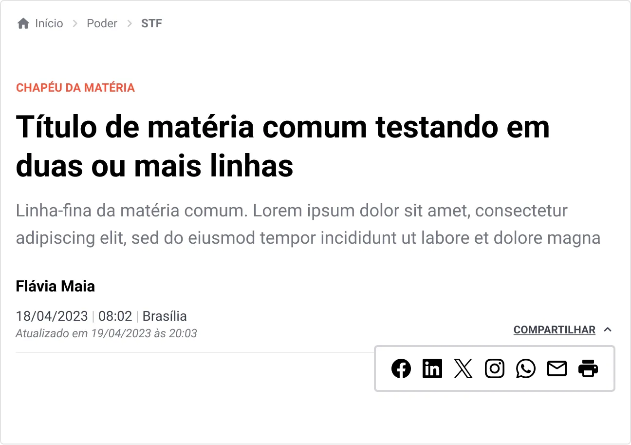
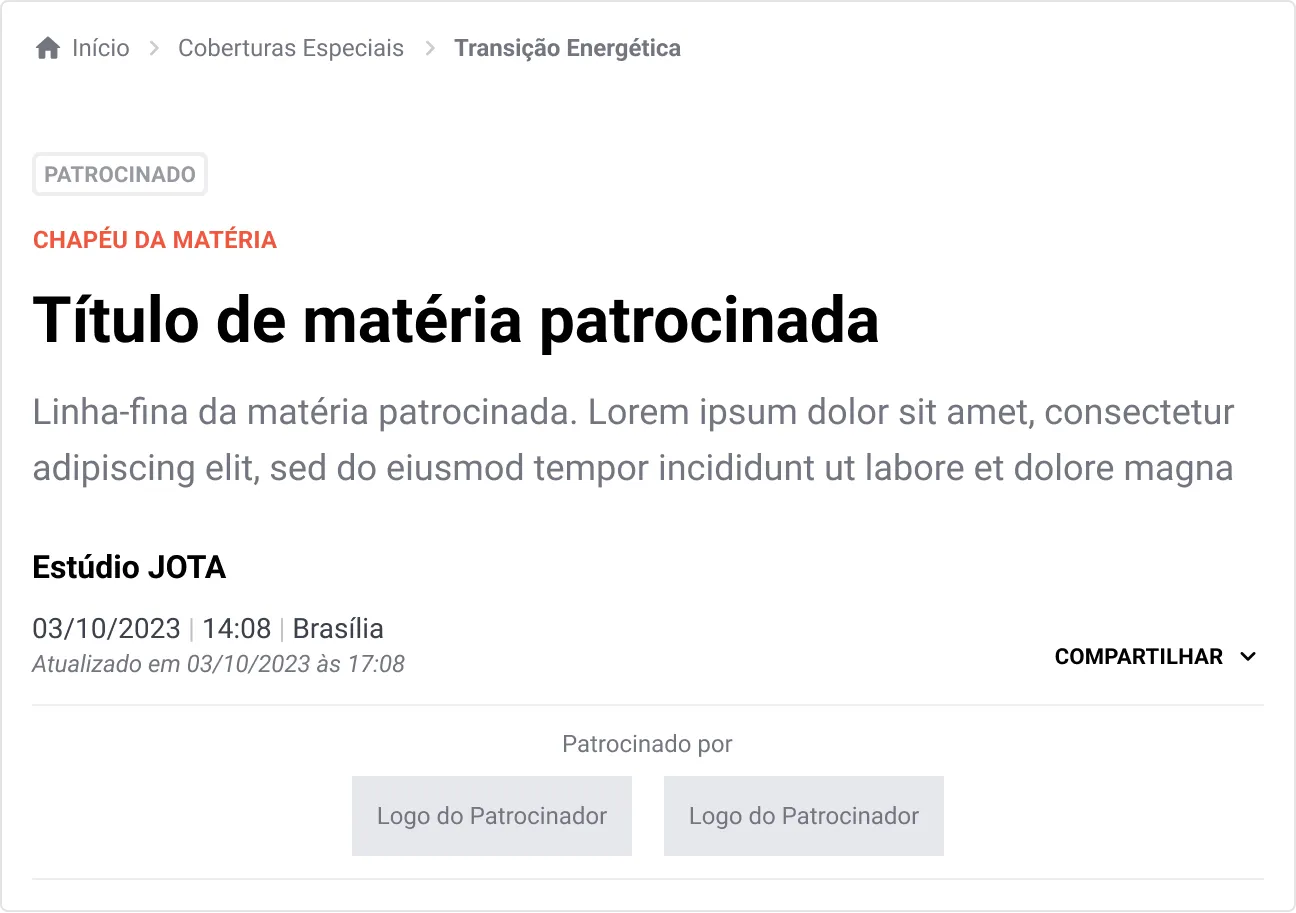
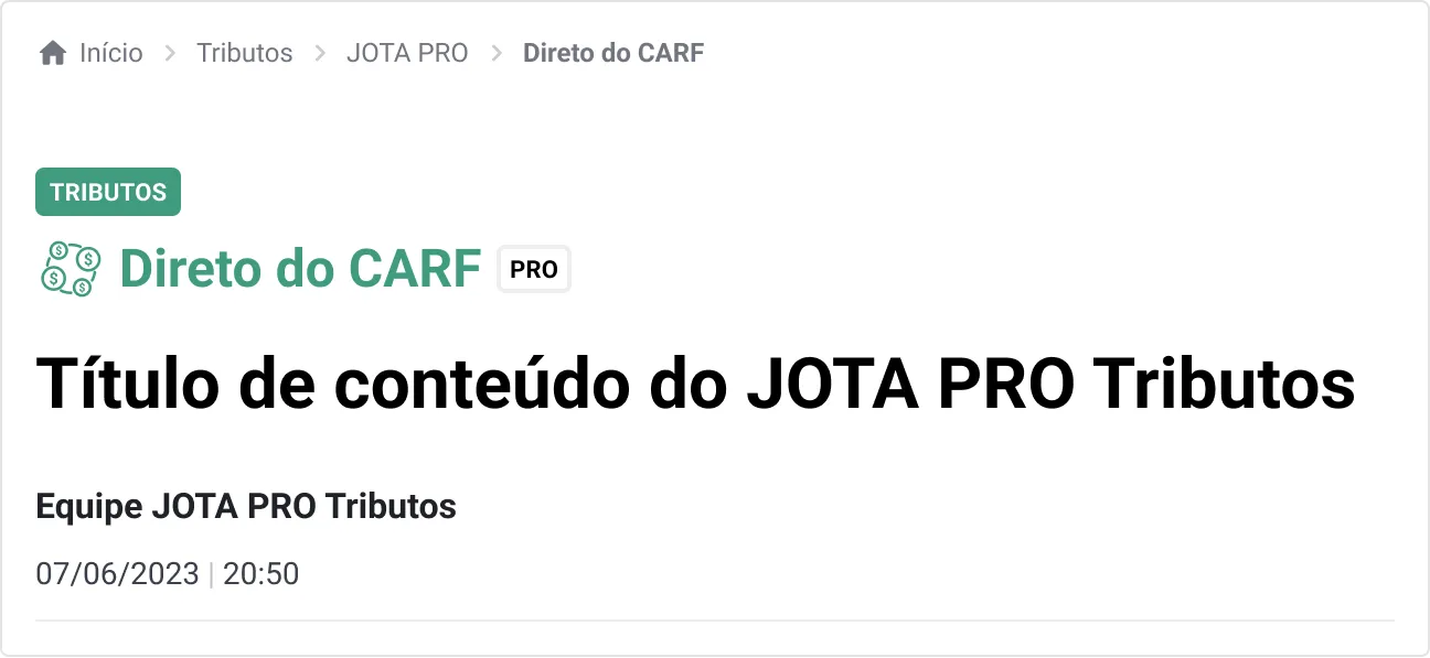
Differences between the types of posts. PRO content is locked, so it doesn't have share options
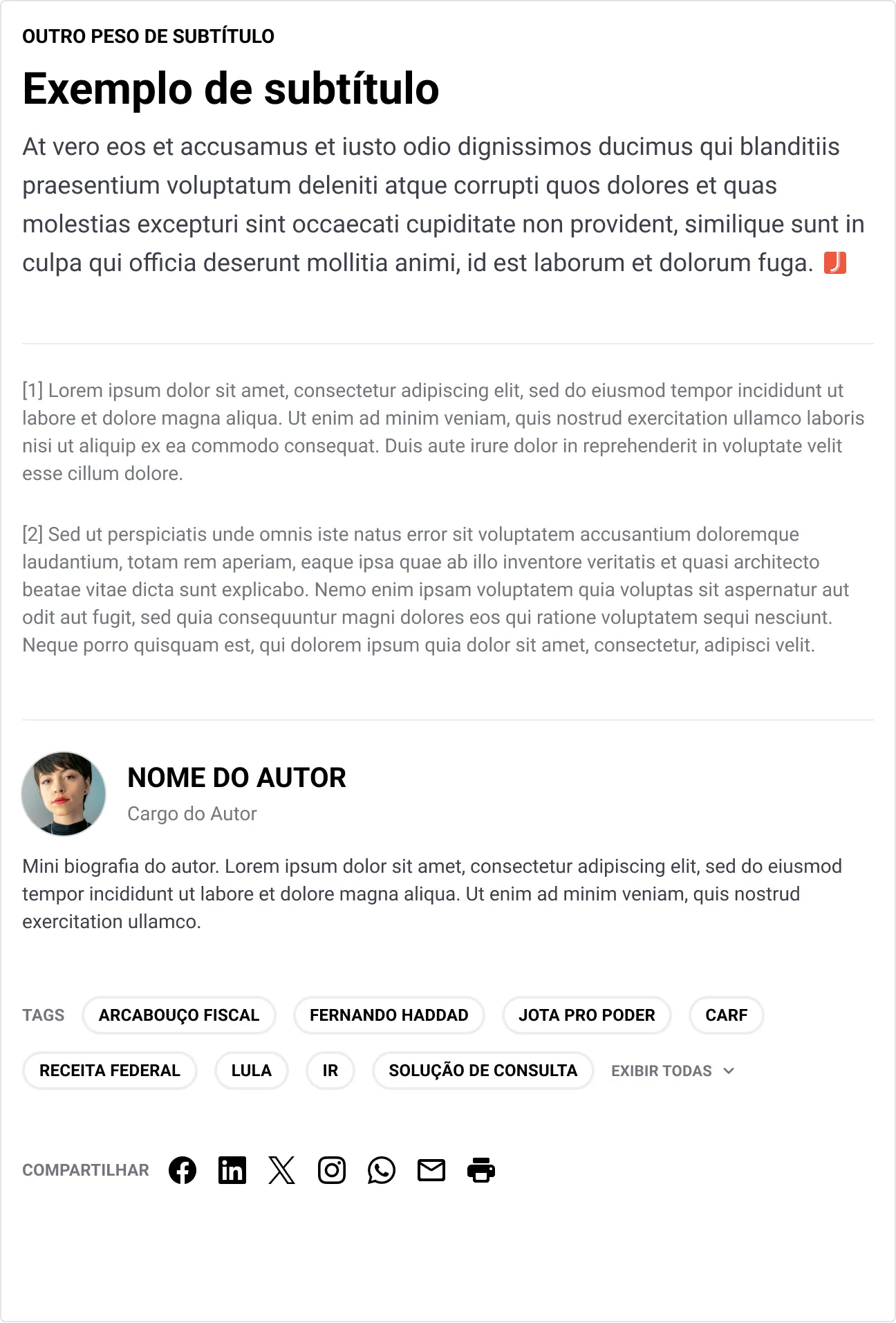
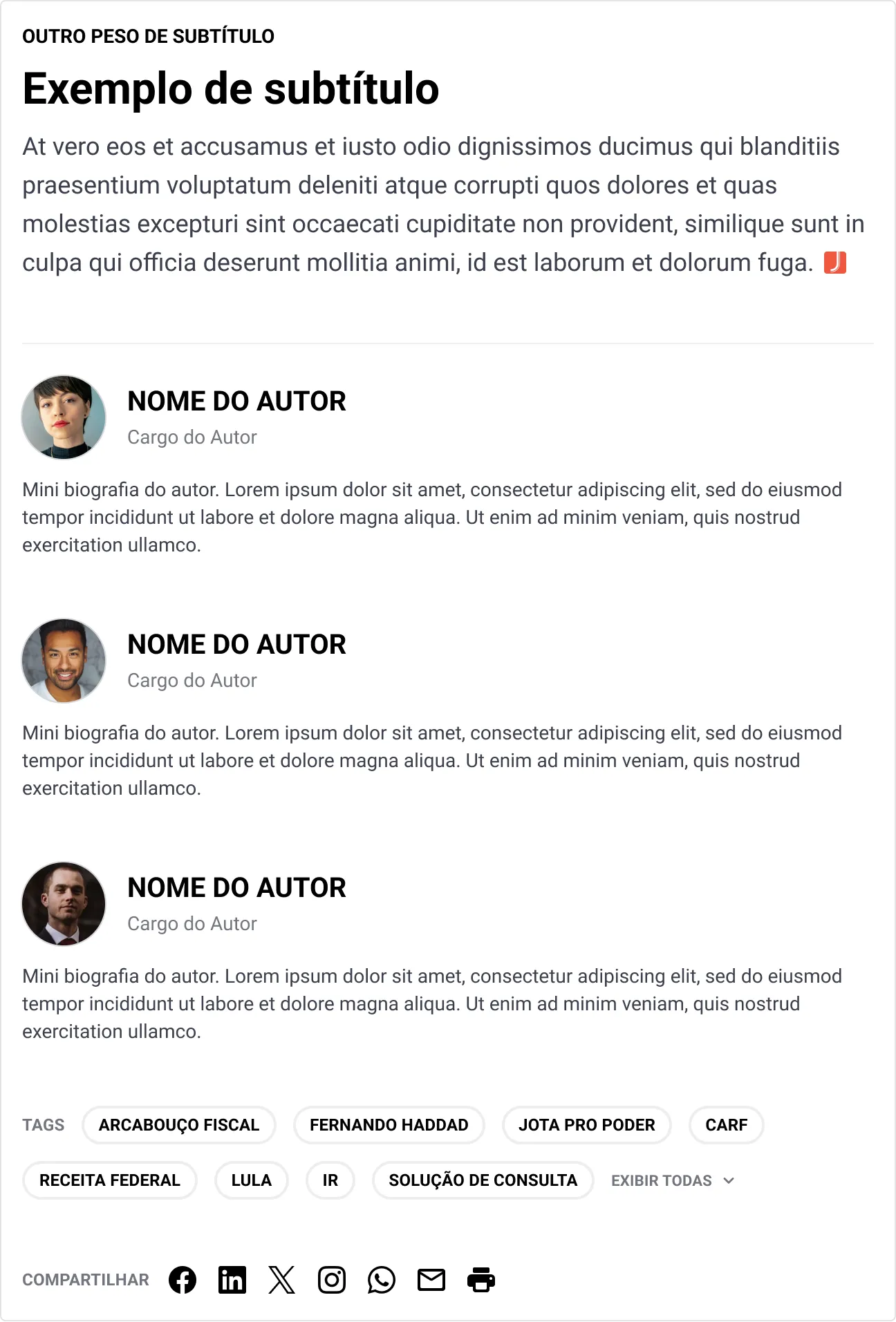
Some articles have foot notes, others don't. And some content may have single or multiple authors
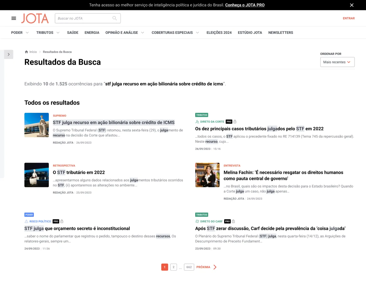
Now for the search results, we prioritized not only the usability and visuals of the filters and ordering, but also the technology/functionality behind it, now using Open Search. It's a huge improvement compared to what we had before on the old news portal, where sorting and other filters didn't work properly and caused a lot of frustration on our users.
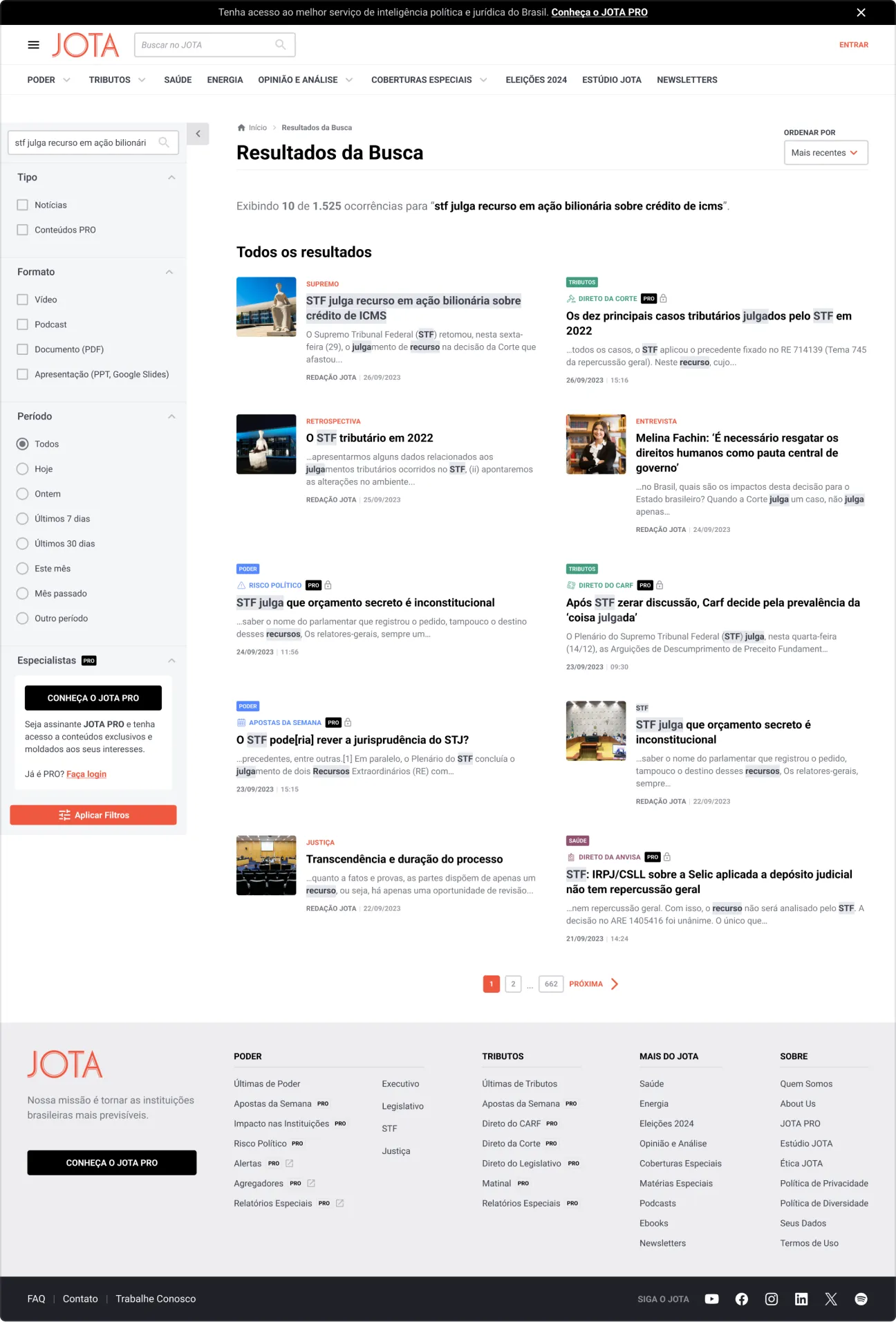
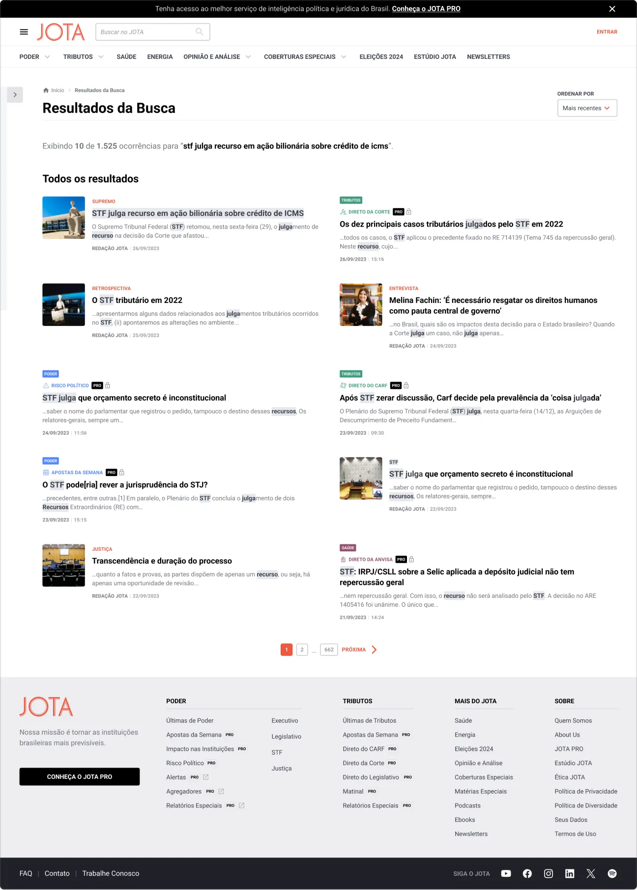
Search results on desktop. Showing the filters expanded (default view) and collapsed. You can alo see an example of another plan, Saúde
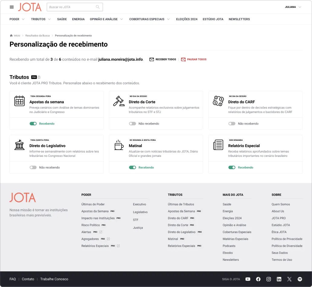
After showing the previous pages for the Stakeholders and gathering feedback, me and my partner created a usability test on Maze for a feature we were eager to implement: control over content. In the meantime, we've launched the closed beta for a few selected PRO clients, and interviewed some of then. A lot of our suspicions and hypothesis came out true, and we started worked on the improvements right away.
To make everything in time for the first release, we had to cut off a lot of stuff. We focused on what was necessary (MVP), without compromising on visual quality. We were able to create as a seamless experience as we could, with fewer features.
After almost 2 years, a lot of work, new Design System components (and refactoring others), tests and feedbacks, it's finally here: the first release of JOTA Único is now public. It's still on beta, it's still an MVP, but it's live. You can check it out on beta.jota.info.
For this first public beta phase, we're gonna conduct a test to prove the hypothesis that we can amass the same or more MQLs for our lead base. To do that, we're redirecting 50% of the old portal traffic to the new beta address. After that, we're gonna monitor the users behaviour, clicks and events with Hotjar, Google Analytics and Google Tag Manager, all gathered up in Looker Studio dashboard.
The first results of the test are in, and are very promising. Throughout our Hotjar analysis we've saw that the number of "angry clicks" went from 10 to zero in a week, compared to the old homepage. Also, time spent went up, bounce rate went down. We had some problems implementing Google Tag Manager, but as soon as we sorted it out, the leads started to come in. It's still early to claim victory, it's gonna be a long process, but I'm certain it'll get there. We achieved all this with just an MVP. The sky is the limit!
There where more people involved throughout the years, I'd like to thank everyone that helped put this project to life.
Tools: Figma, Storybook, Google Analytics, Google Tag Manager, Hotjar, Maze, Miro
Product cycle: 2022-now
JOTA “Único” is my biggest project to date. Through this project I accumulated a lot of experience not only as a product designer, but as a technical leader, who worked in synergy with my designer partner, the developers and the PMs, making sure to deliver the best possible result.
And I delivered.
Thank you!